
Having run out of oil painting sheets (see Learning to paint using oils), I thought to give watercolors a try. I already had necessary supplies at home, and bought some average quality watercolor paper from a local stationary shop.
Watercolor as a medium is very different to oils, in terms of blending characteristics and drying time. I was excited to experiment with watercolor and thought it would be much easier to handle. But it was a failure to being with, I found it hard to use the right amount of water and was always slow to apply colors while blending. The color dries super fast so the next few steps have to be planned in advance, and it’s not like oils where you can get a coffee in between applying two brush strokes.
I am getting a bit used to these, but still not very confident. I am sticking mostly to using lesser water, and applying color in thick mostly, and applying in dry for texture or highlights.
I am using A3 sized Magnani 1404 Umbria paper which I cut into A4/A5/A6 sized paper. The quality of paper is average, okay for practice. I started with an old set of Camlin poster colors, and later switched to Camlin water colors. Poster colors are more opaque than water colors, which is expected. Again, these colors seem okay for practice.
Painting #1
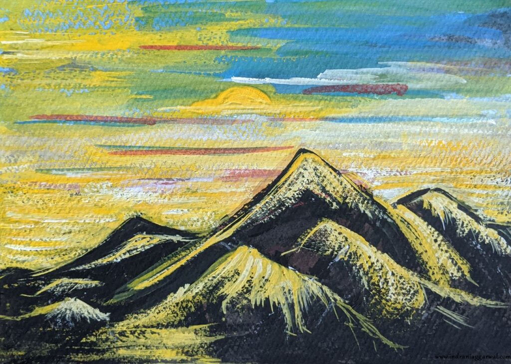
This one is just taking each color in the set and trying to get a feel of its opaqueness, vibrancy and blending. I didn’t have anything particular in mind while painting this, but sort of went from blue/red to yellow/white to green/brown to depict a usual landscape.

Painting #2
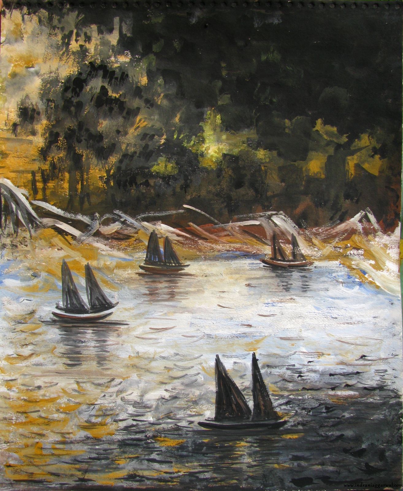
I have a water color book by Milind Mulick at home and picked this scene from it. I was prepared for it to be challenging, and it was so but the end result is rewarding. Had to take a lot of inputs from my mother about how to paint various things (especially the trees and the road). She had to do finishing touches though, which bought the painting to life. This one is painted on size A4.

Painting #3
Exhausted from painting above, I wanted to paint something quick which does not involve any layering or blending.

Painting #4
Another quick one. Here I tried to give some texture to the background using a bigger flat brush.

Painting #5
After watching a couple of Youtube videos on watercolor paintings, basically the ones where they paint an awesome scene in short time, I thought how difficult can it be and gave it a try. Obviously it was a disaster! My mother then (re) painted on top of it.
Painting #6
Painted by my mother on a black paper.
Fun fact – the paper was black because I painted it black on top of another attempt to recreate the painting in the Youtube video.

Painting #7
Back to basics, apples!

Painting #8
Another apple. The initial version (painted by me) was a disaster, and I had to ask my mother to fix it somehow. Turned out well in the end.

Painting #9
Painted by my mother. This is on size A4 paper.
Painting #10
Finally, painted something which looks nice. The idea was to paint a cloud inside an ice cream cone, but it doesn’t look like one. I made a mistake to paint the background after the clouds (or cream 🙂 ) so the looseness of the clouds was lost. The cone turned out very nice though.

Painting #11
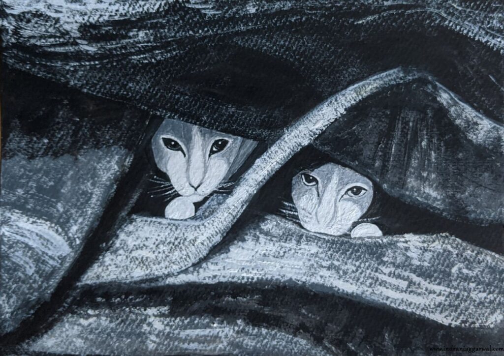
One of my dear friends has two cats, and he often shares pictures of them. I decided to paint the one where the cats were peeking out of a blanket. It was also a bit easier as he clicked it in back and white. He’s happy with the result, so I’m happy :).
Painting #12
Back to a landscape. Vast fields with hay rolls always captured my fancy, so I decided to paint these from a picture I found on the internet. My mother had to repaint the clouds (as always).

Painting #13
Painted by my mother.

Painting #14
Next few paintings are mostly doodles which I made when I was absolutely not in any mood to paint something proper. With watercolors its easy to just pick some colors and start playing around (as compared to oils).

Painting #15
This one was done on back of another painting just using black color and varying level of water in the brush / stokes.

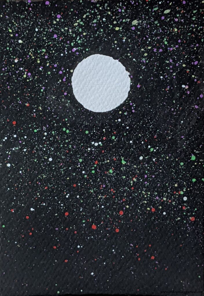
Painting #16
My brother suggested to make droplets (in this case stars around a celestial object) by flicking the brush. Interesting!
Painting #17
I am fascinated by the Mauve color in Camlin water color set. This one is using only Mauve color with different style of brush strokes to indicate stormy clouds and rough water (and also the boat).
Thanks for going through the showcase. Please feel free to post any comments or give feedback, and in case you’d like to know more about any of the paintings above please feel free to ask.
Have a nice day!