
While at home during the lockdown I decided to finally try my hands on oil painting, with my mother as my mentor. I started with painting straight on a biggish canvas as that’s what I have seen my mother paint on since my childhood. Painting on canvas is fun, and will produce something which will last for years and can be easily put on a wall etc, but it’s time consuming and may not be the best to experiment. So, I decided to get small sized sheets on which I can practice and try out a new idea every couple of days. I wanted to get size A5 sheets and accidentally ordered A6, but it turned out to be a blessing in disguise because I just loved A6 sized paper (which I think is similar to a postcard).
Here I showcase the paintings which I made on these postcard sized oil sheets. Sometimes with my mother giving finishing touches, or just taking over in the middle when she thought I was just destroying the painting :). Most of these paintings are done using some reference image that I found on internet. I spent about a month painting these, spending a few hours on each painting.
I used Brusto Artist Oil Paper and will highly recommend it. Other supplies I already had at my home, but I’d like to mention that my mother prefers to use Camlin oil colors (and oils), and for me they worked perfectly as well.
Painting #1
I wanted to give the paper a try and just started doodling. In fact I painted on the wrong side of the paper which I later found out when the sheet started to warp a little after a couple of days of drying. I was lucky that this one didn’t turn out be a disaster and kind of encouraged me to carry on.
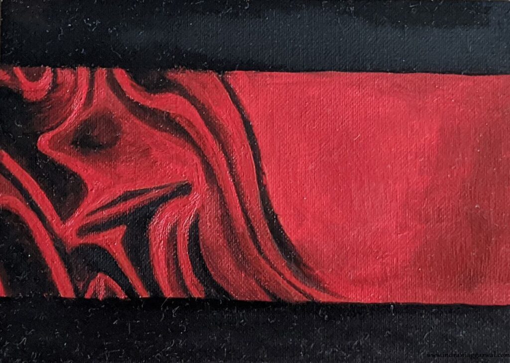
Painting #2
I wanted to paint something in blue and red, and so picked this one up next. First version had whitish background, but later changed to light blue.
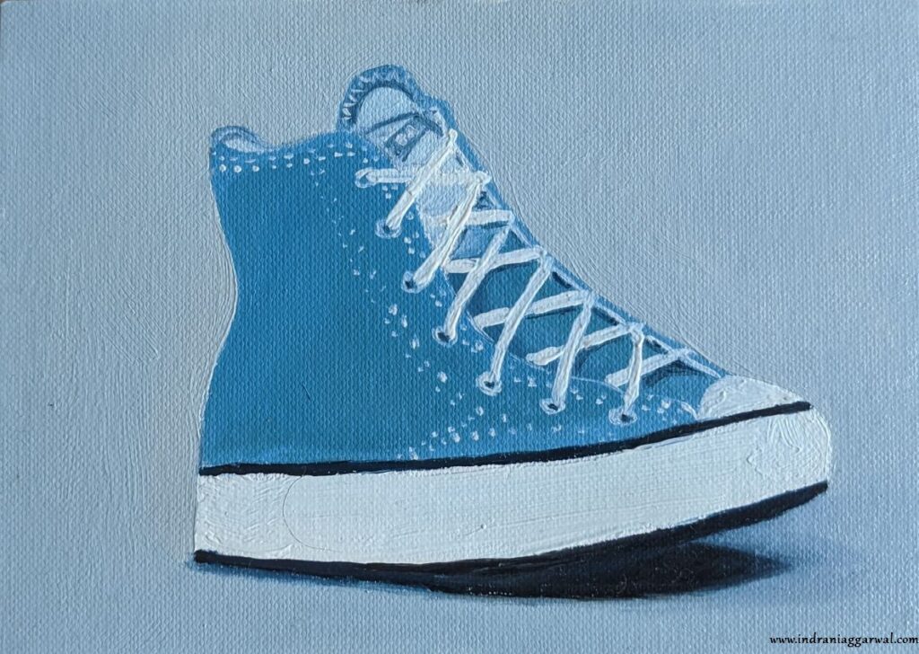
Painting #3
As I had some blue and while color left on my palette, decided to go blue and white again for the next one. I found a nice picture of a converse blue/white shoe and tried to paint using that as reference. I specially like this one (even though the shoe looks a bit off proportionally) because the shadow and overall color matching looks pretty nice.
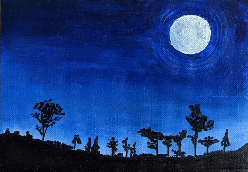
Painting #4
This was was done in a hurry as I wanted to paint something quick with lots of crisp ultramarine blue. I was a bit scared about adding the “rings” around moon as the blue was still wet, but decided to take the plunge, and more or less got what I was looking for. Nice.
Painting #5
With palette cleaned, time to move on to other colors. I found an amazing fruit still life image on the internet and decided to use the orange from it as reference. I think the first serious painting of the bunch so far (and my favorite as well), had to spent a lot of time making sure the colors and details are right.

Painting #6
Wanted to try to paint something with a shadow again as the orange turned out really well. So, picked up this flower. Probably the toughest of the entire bunch, as it was hard to achieve the flowery look. Also, my mother made some changes in between which I didn’t fully agreed with 🙂 so had to undo them.
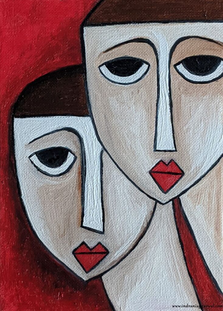
Painting #7
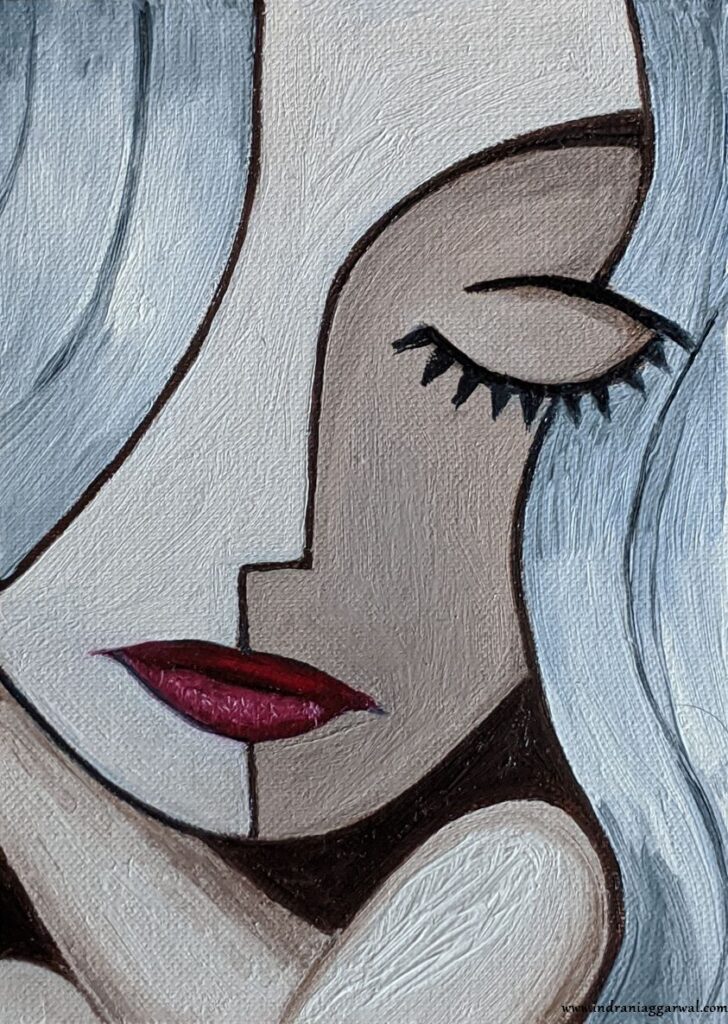
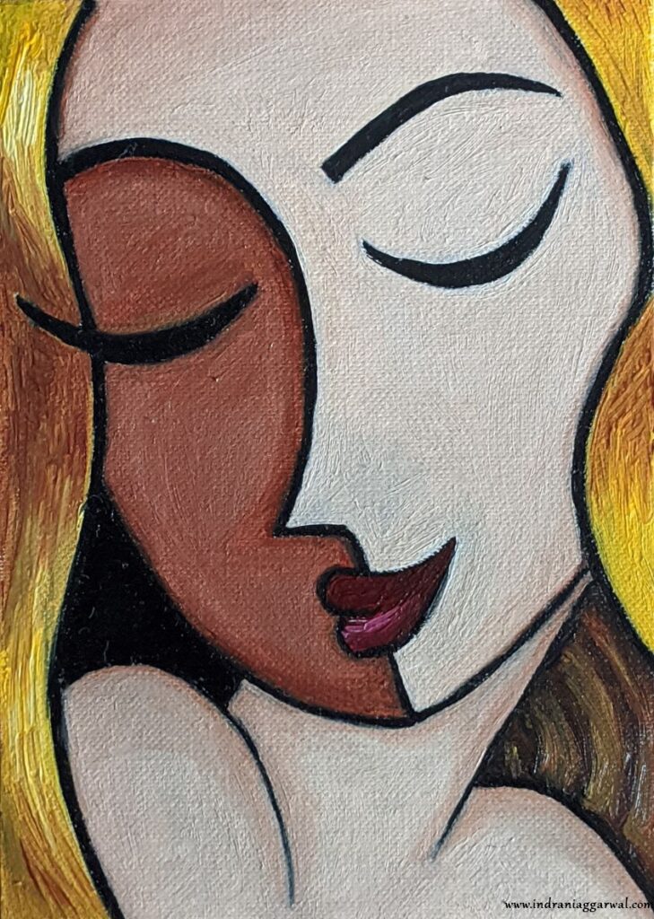
Next painted some faces. I was lucky to find very nice reference images on the internet.
I was pleasantly surprised to see how well red goes with brown and white.
Painting #8
Lips (and most of the hair) in this (and next) painting are painted by my mother as both myself and her thought that if I did it then it will be a disaster.
Painting #9
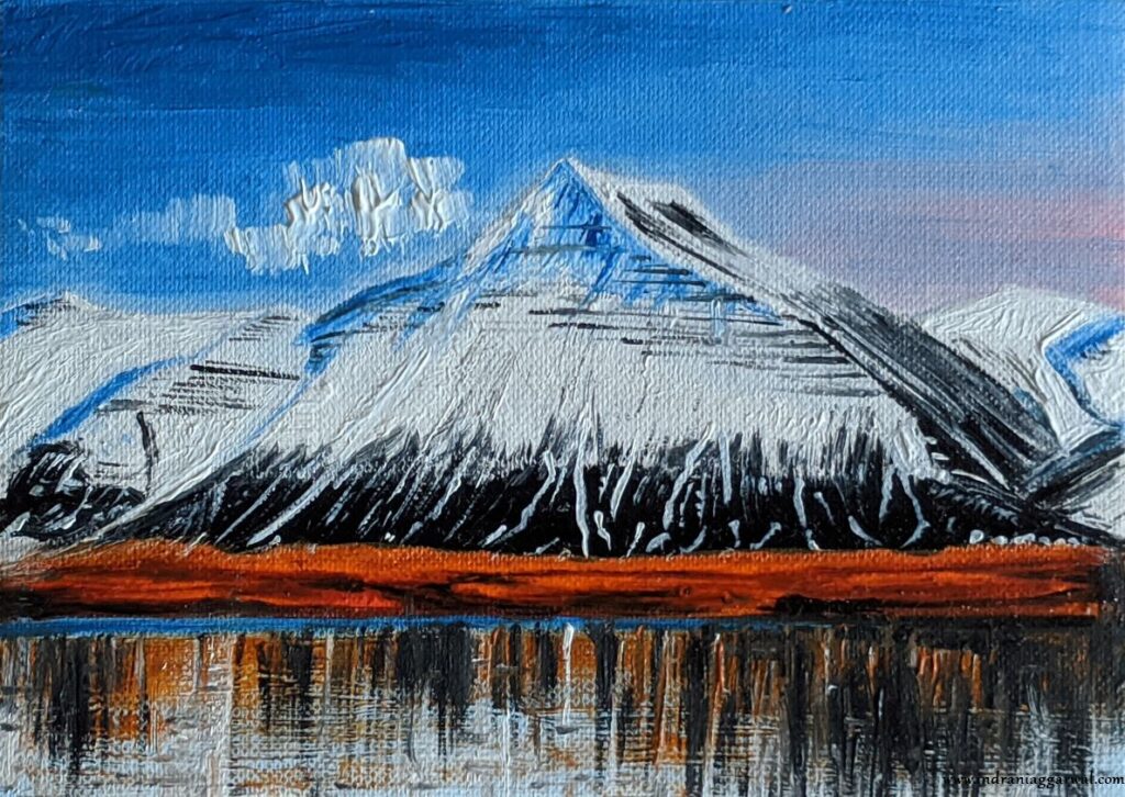
Painting #10
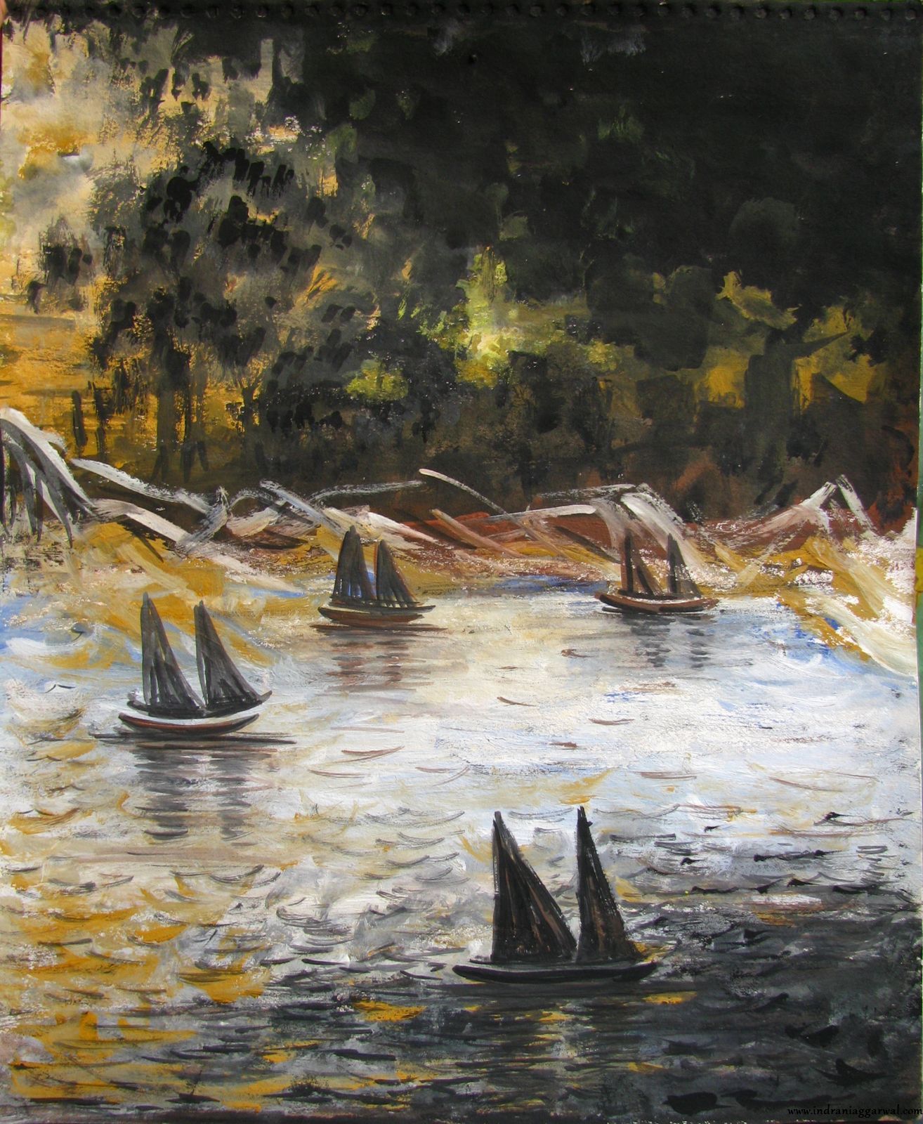
I wanted to try to paint something which has sky in it (as my mother is an expert nature scene painter so I was always fascinated by such paintings). Picked a simple scene and painted this one rather pretty quickly. I thought it turned out okay, but my mother was not happy and later redid the lower half (the mountains).
One of my friends commented “khooni pahad” after seeing this which translates to “bloody mountain” in English.

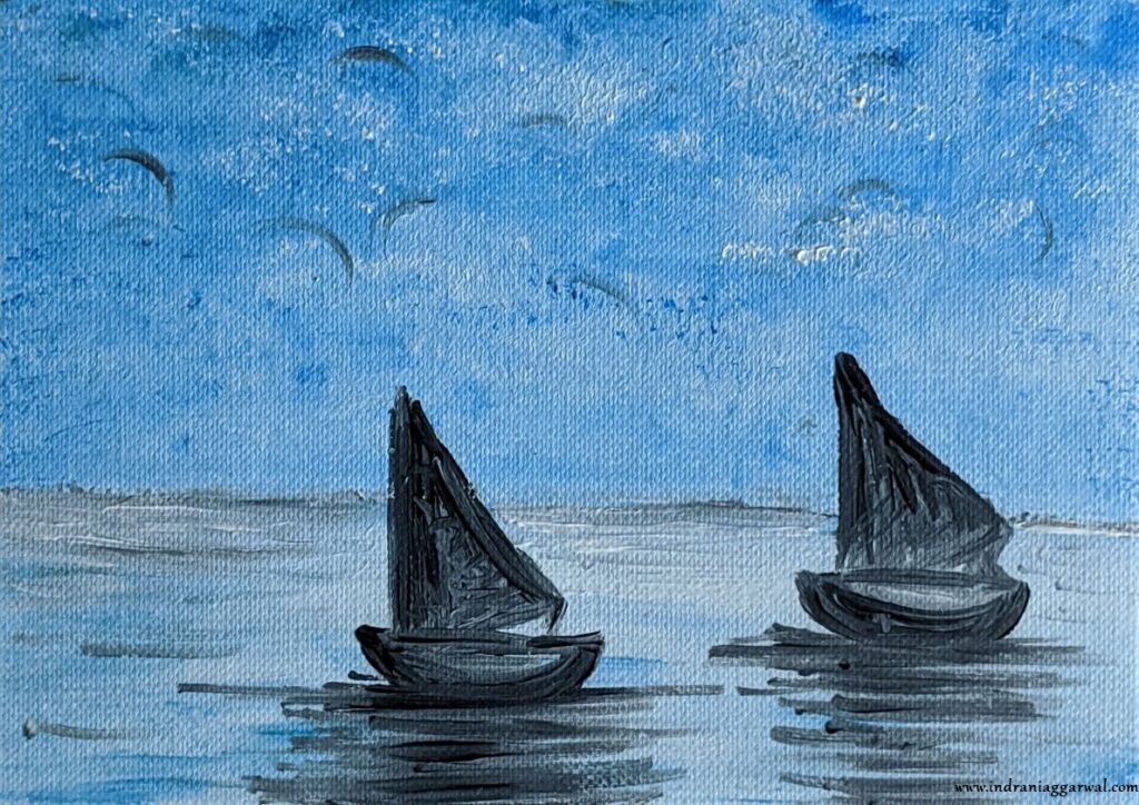
Painting #11
Another one of the experiments. Here I tried to paint a folded cloth, I guess too difficult for someone at my level. In the end looks more like an abstract design rather than a folded cloth.
Painting #12
I wanted to try another nature scene just to see if I can paint something which can qualify as a decent nature painting. I used a photo from internet as reference.
My mother didn’t like the sky which I painted and painted it again. Well, her version definitely looks much much better. I thought it will be a bit tricky to paint the reflection in water but my mother taught me how to do it in layers. Basically the blue (and brown) of water was applied first and made to dry, and the reflection was painted on top of it with not so thick/wet paint.
I think overall it turned out pretty nice.
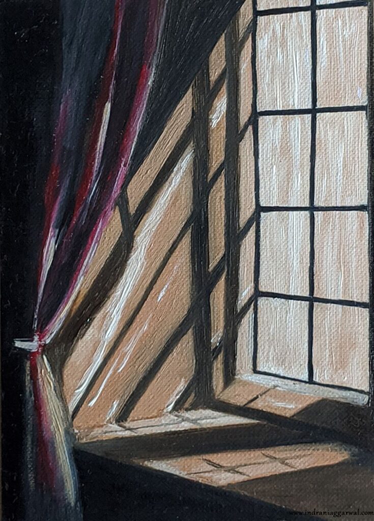
Painting #13
Next I wanted to paint some shadows, and picked this Chiaroscuro. My mother suggested to put a lot of white in the window (vertical strokes with a not so wet brush) to give an impression of a window filled with sunlight. Turned out pretty well.
Painting #14
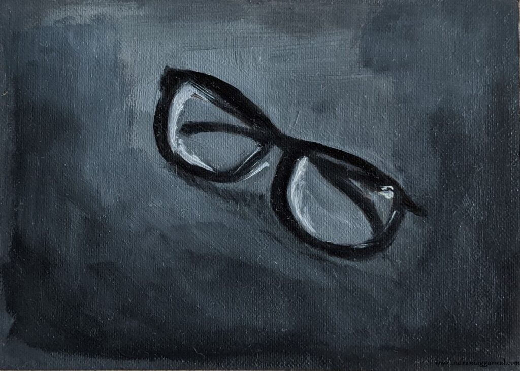
Another reflection. Turned out to be much easier that I thought as just drawing a few white lines on black is enough to give the illusion of an object being there.

Painting #15
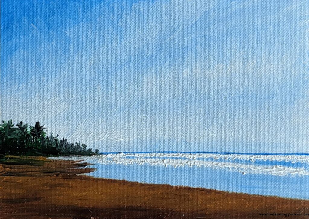
I always wanted to paint a scene in a photo I took of a beach in Bali. So, this one is next.
The most tricky bit are the clouds. Initial version was pretty terrible and my mother repainted clouds, which started looking awesome after that. Picture below does not do proper justice to this painting, it looks so amazing when looked up in real.
Painting #16
This one my mother painted when she was in the mood to doodle a bit.
Painting #17
Next I picked up another challenge, to paint northern lights. I was prepared for it to be a failure :), but still wanted to give it a try. It took a lot of thinking to decide exactly how to go about this and which colors to apply and in which order. I guess turned out okay, definitely not a disaster.
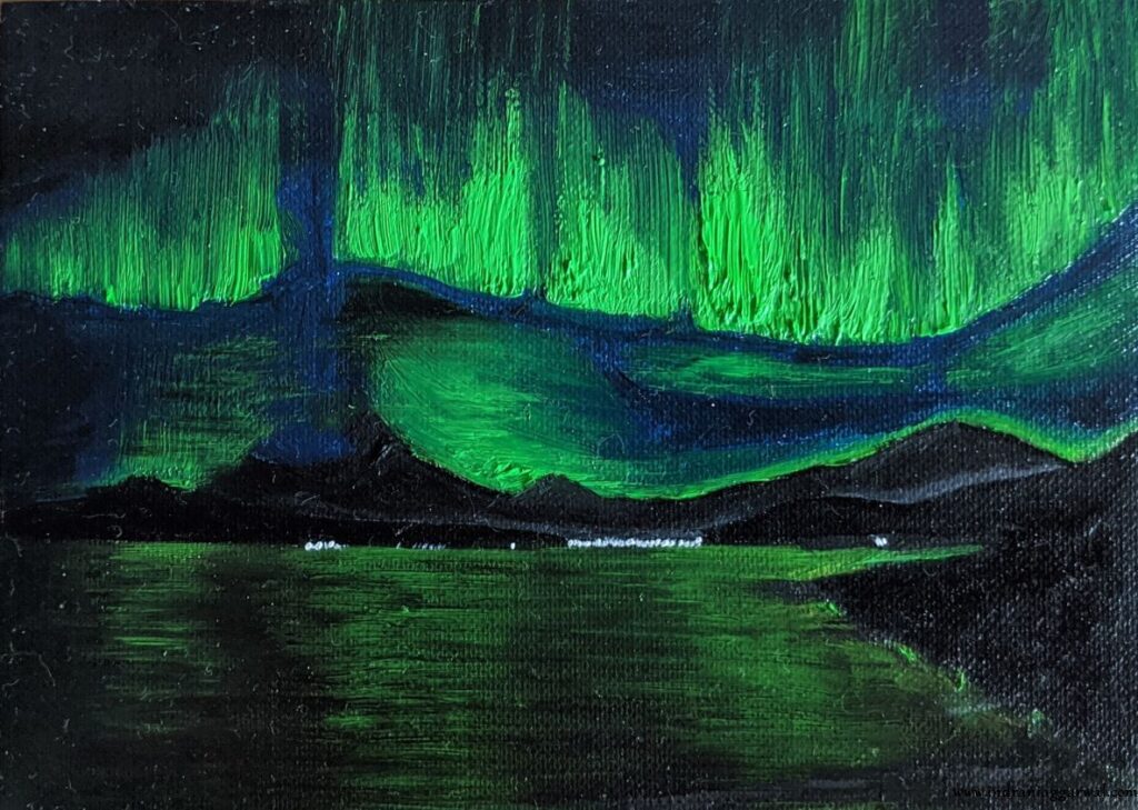
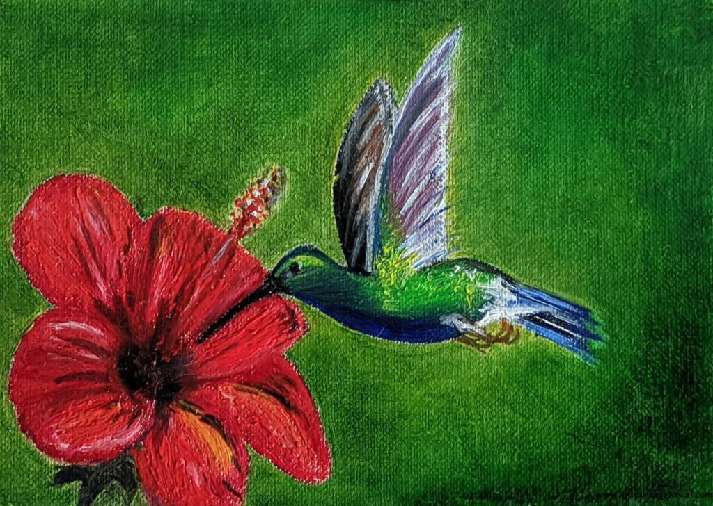
Painting #18
I thought next I will try painting a bird, and a hummingbird on hibiscus captured my fancy, mostly because the combination is so colorful. It was tricky to paint the flower, especially to get the red color right. The initial version of background which I painted was not really pleasing, so my mother repainted it.
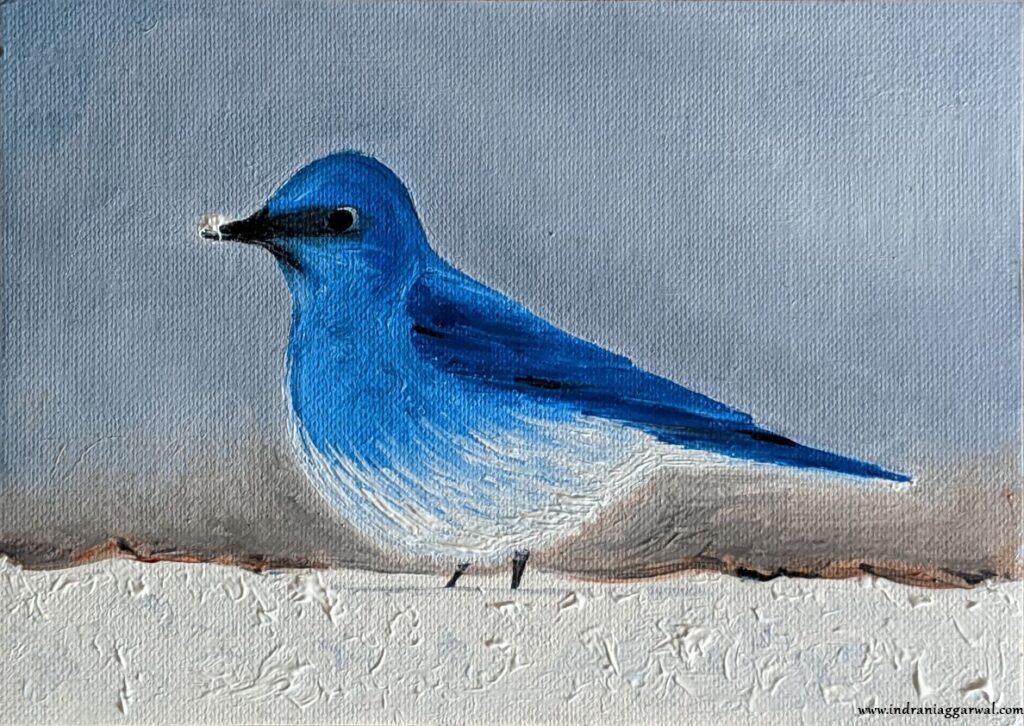
Painting #19
Another bird.
This was the last sheet I had and there was a lot of leftover white color in the palette so we painted the snow in thick. I think it looks cool.
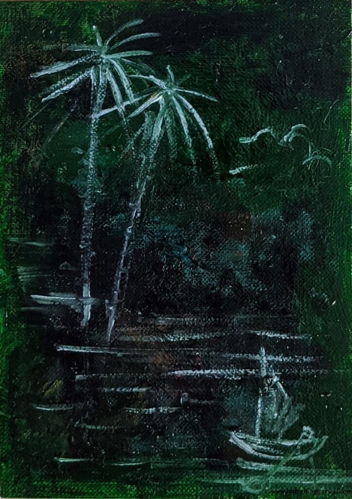
Painting #20
There was a sheet of paper which was reserved for doodling and cleaning up any leftover paint in the brushes. It was mostly green and black towards the end. My mother painted a quick scene on it.
Thanks for going through the showcase. I had a great time (and learned a lot) while painting these and had the best mentor one can wish for, my mother, by my side. Please feel free to post any comments or give feedback, and in case you’d like to know more about any of the paintings above please feel free to ask.
Have a nice day!